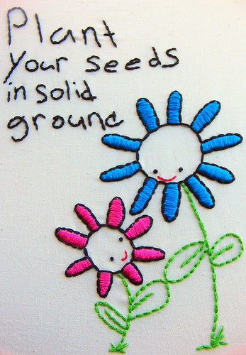
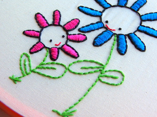
Here it is, my WIP from the other day:


(Pattern by Annie Oakleaves.)
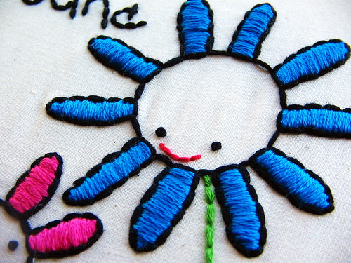
So, I am kinda annoyed about the way the color turned out in the pictures. The blue is really a bright turquoise, though it doesn't look like it. I took about a hundred (no joke) different shots of this in different light, using various camera settings, but nothing I did made a difference. Every pic turned out the same: the larger flower looked royal blue. I even tried tweaking things in Picasa, but it didn't help. I guess that's a sign that I should get Photoshop, lol. Oh well. That last picture is the truest to the actual color.
Yawn. I am a Sleepy Sleeperson right now. But there's still work to be done before I go to bed tonight. I purchased some really cute Christmas patterns today that I can't wait to get started on. You are gonna flip when you see these! I will be back soon with some yummy pics. Until then...
Happy Stitching!
(PS...If you left me a comment on my last post, be sure to check back...I answered your questions in the comment area. :) But I hit the 'publish comment' button when I meant to hit 'preview', so please ignore the errors.)
♥-♥-♥

That is beautiful. I'm sorry the true colors don't show up, but your work is lovely.
ReplyDeleteI added this comment to one photo in your flickr stream, but they show up turquoise for me. Couldn't say if it's the same shade of turquoise as it is in real life, but it's definitely not royal blue on my computer.
ReplyDeleteIs your monitor calibrated? I have no idea really how you do it or what calibrating does precisely, but Brian mentioned something about it to me a while ago. He has some gadget thingie that can do it, but I have no idea how it works. Maybe just something to think about....
Especially with my Mac now, I'm always wondering if the colors *I* see on my laptop are the same colors everyone else sees....
I like this no-longer-a-WIP WIP. ;o)
Oh it's so cute! The colour is quite turquoise for me and being a major stitching geek I can practically guess the floss number you used LOL. Sometimes taking an accurate photo of embroidery is unbelievably frustrating.
ReplyDeletehmmm...
ReplyDeletei've always had this problem with my camera when taking pictures of bright colored flowers... i think the lighting plays a big roll and in how the camera lens picks reads color. if you look at the last image it doesn't look so saturated... still, it's so frustrating, isn't it?!
very cute embroidery though :)
Darling little project like I said in my last comment. I know haw frustrating it is to not get the right color,but what is posted sure looks pretty. I can't wait to see the Christmas goodies, I just finished one project and I'm starting on an old Marie Claire Idees pattern. I did a post on it if you would like to see it.
ReplyDelete